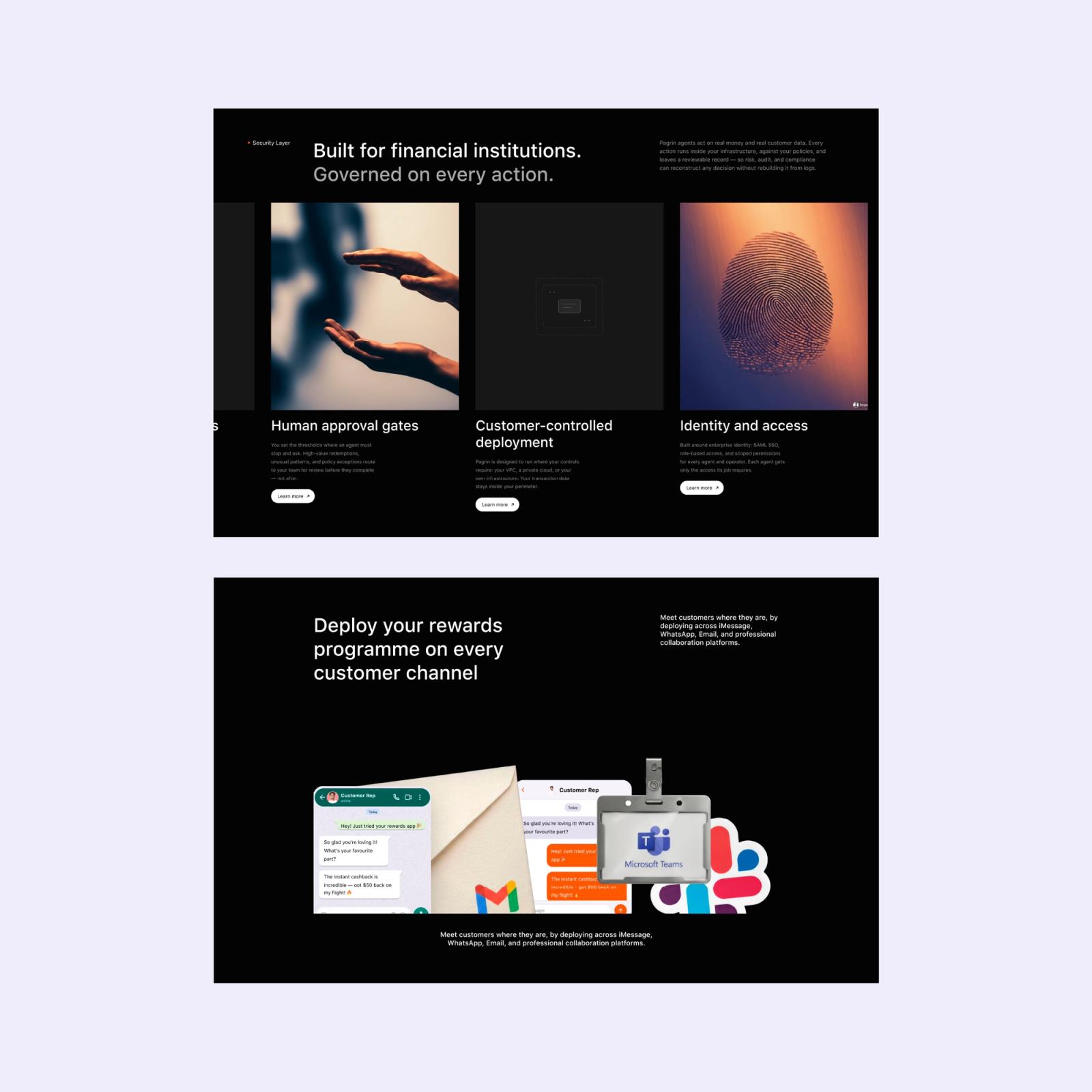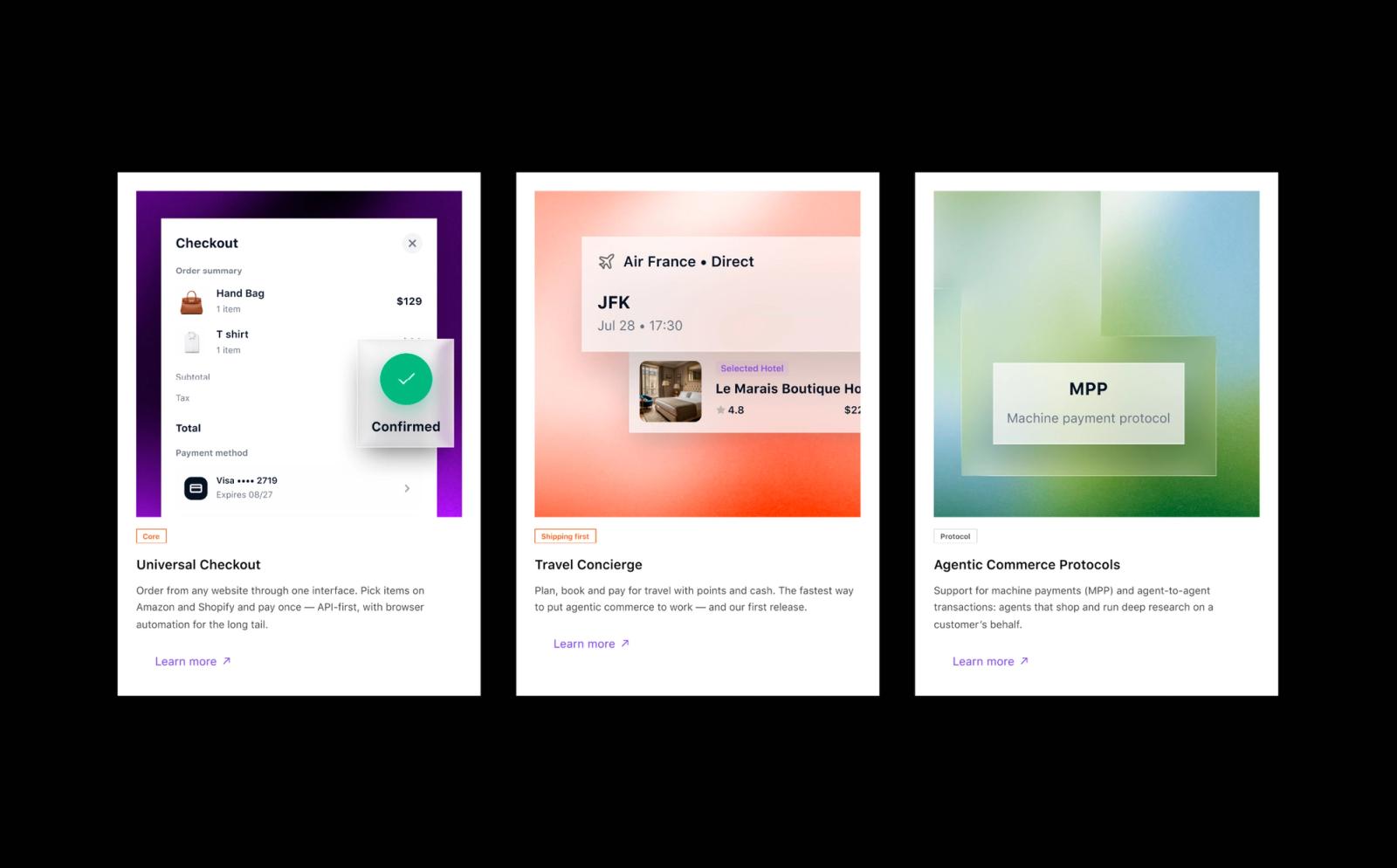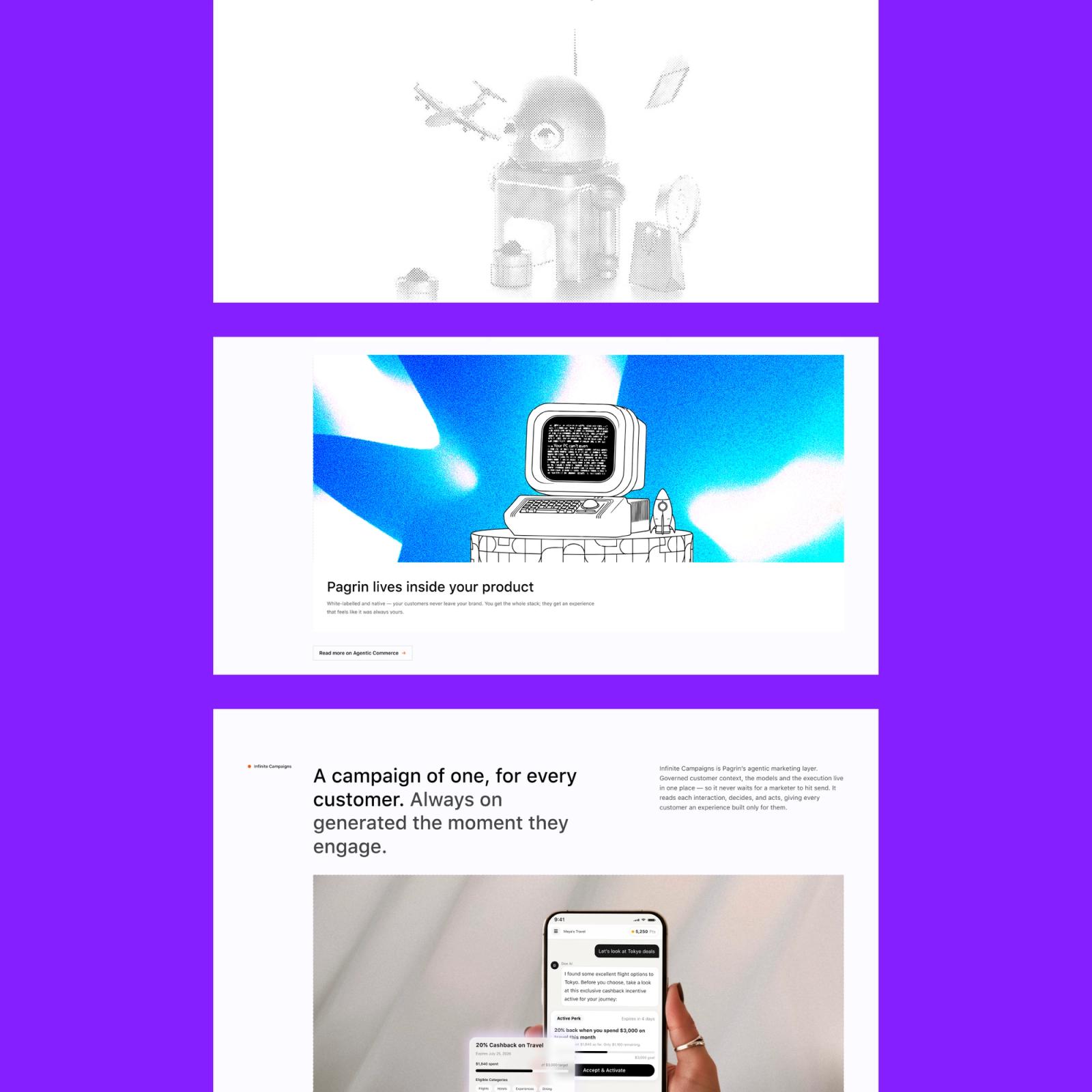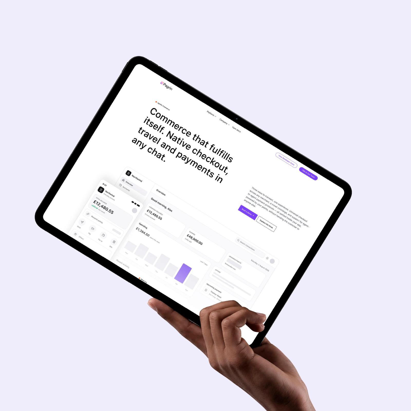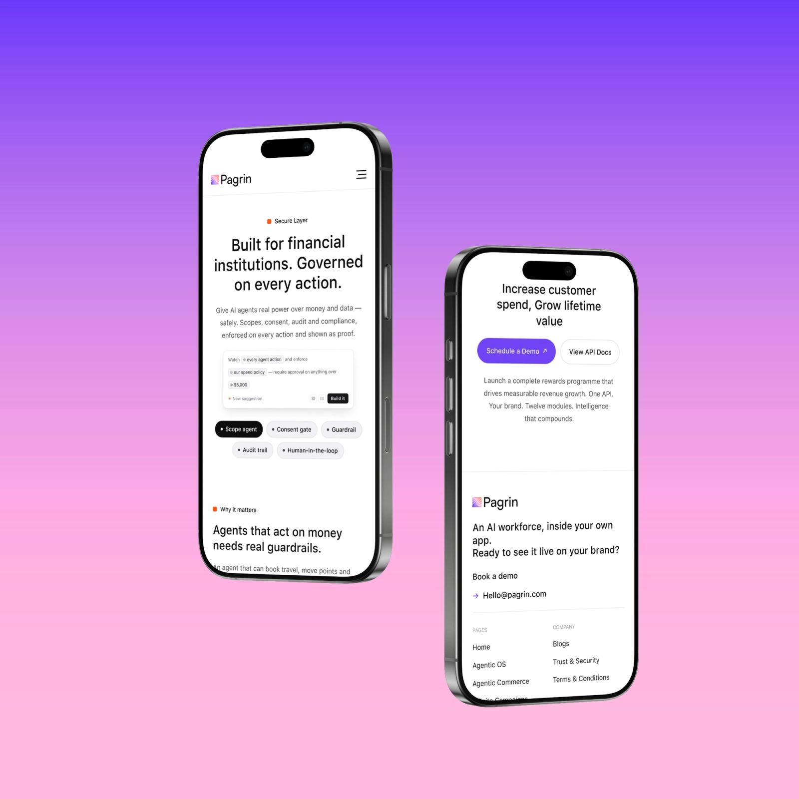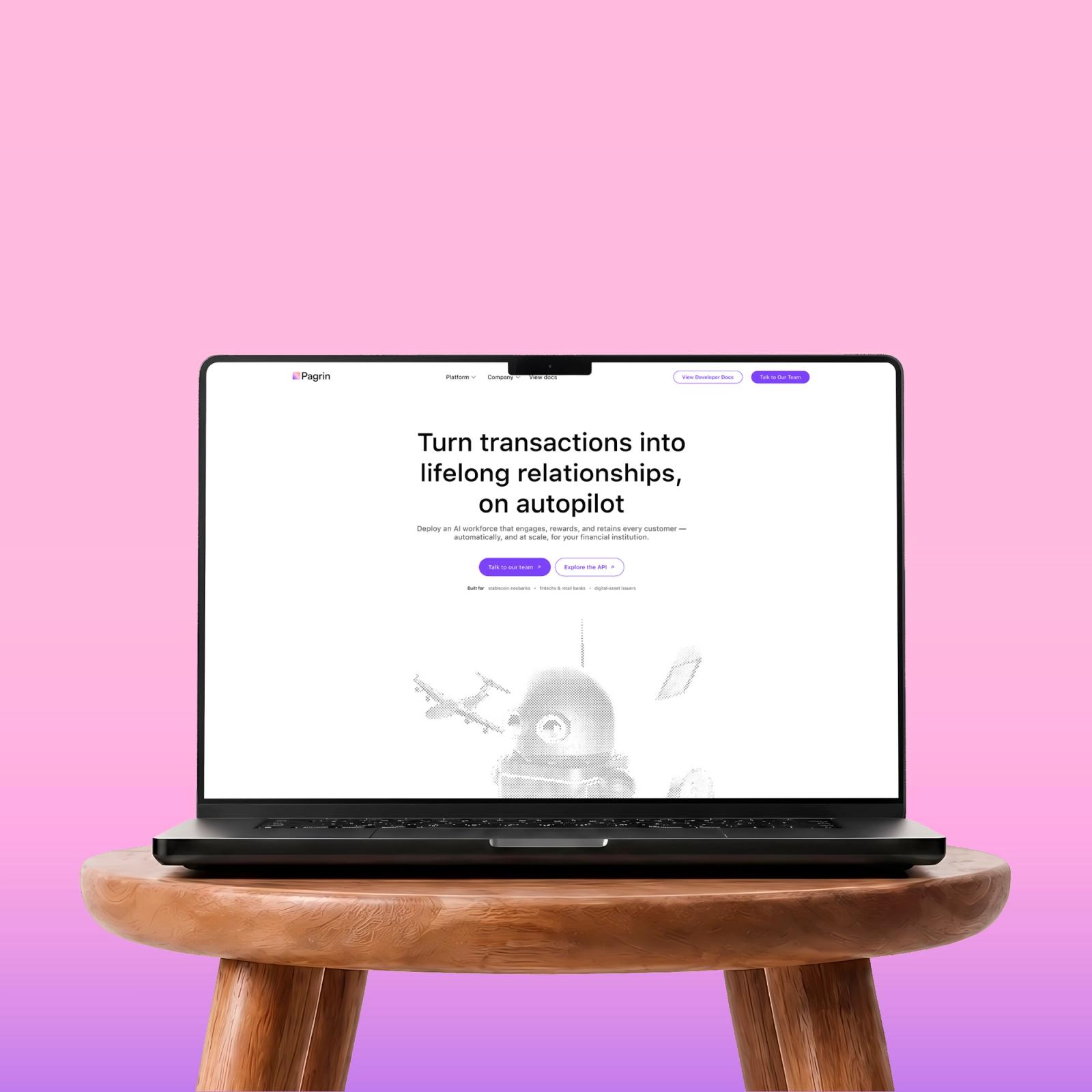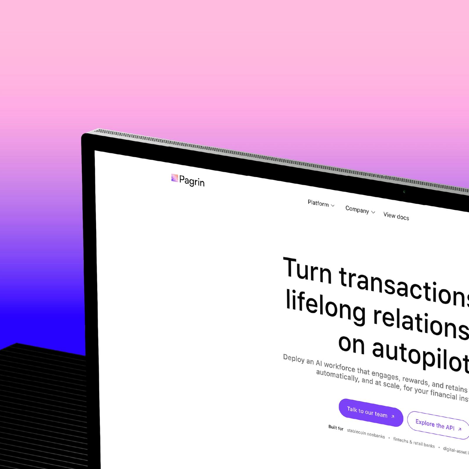
I led product design on Pagrin end-to-end, the story the site tells, the system that holds it together, and the product surfaces beneath it. The marketing site had one job: make an agentic operating system feel obvious and trustworthy to the institutions that would buy it.
The problem
The hard part isn't the technology; it's belief. “An AI workforce for rewards” means nothing to a risk-averse bank until you show it — layer by layer, without hand-waving. Pagrin needed a site that could explain something genuinely new to a conservative buyer, earn their trust, and still feel like a company moving fast.
What I designed
A marketing site with a clear spine — hero → the OS → commerce → campaigns — a deep-dive page for every layer of the platform, and one flat, sharp, SF-Pro language that holds from a 1440 desktop down to a 390 phone.